Discover What's Naturally Possible
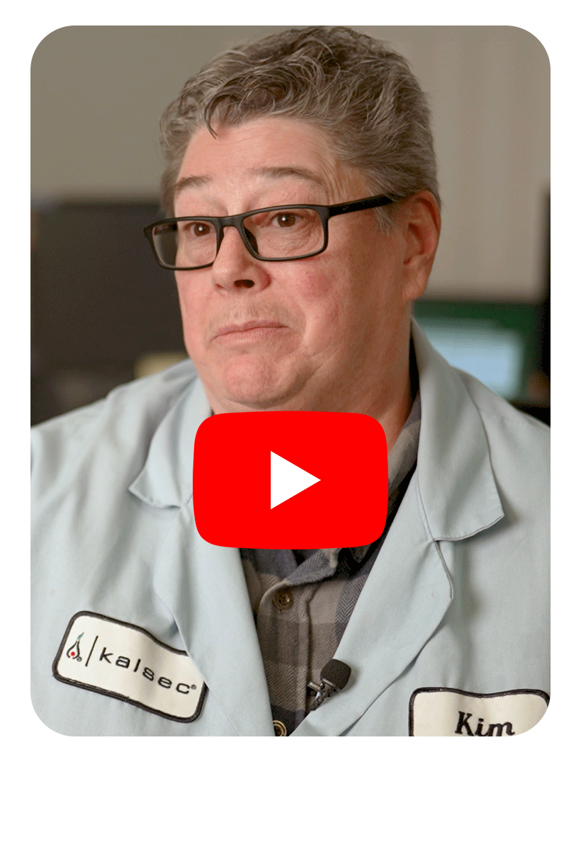
Hear from our experts on how collaboration, creativity, and science come together to help brands solve complex challenges and create what’s next in natural innovation.
Natural Color Solutions
To uncover how Natural Color Solutions are evolving, we turned to Helene Seaver, one of our color innovation specialists.
Read MoreNatural Taste & Sensory Solutions
Curious what's shaping the future of Natural Taste & Sensory Solutions? We asked Anna Cheely for her insights.
Read MoreNatural Food Protection Solutions
To explore what's next in Natural Food Protection Solutions, we sat down with Jennifer Young, one of our in-house experts.
Read MoreKalsec's new identity
Your source for more information on Kalsec's new logo and visual identity.
-
Our new identity reflects who we are today: a global leader in natural solutions, trusted by the world’s most visionary food and beverage makers. The previous logo served us well for more than 20 years, but it was time to evolve. The refreshed design is clearer, stronger, and more versatile across packaging, digital platforms, and global markets. Most importantly, it signals confidence and growth while preserving the heritage of Kalsec’s original story.
Why doesn’t the new logo have an icon? As we explored design options, we found that no single symbol could represent the full breadth of what Kalsec stands for: our science, our natural expertise, our global reach, and our partnerships.
Instead, we chose a wordmark, a logo built from our name, because it puts our greatest asset front and center. “Kalsec” itself carries more than 67 years of trust, recognition, and equity. Some of the world’s most enduring brands, like Coca-Cola, Google, IBM, Sony, also rely on wordmarks. Now our identity does the same: bold, clear, and unmistakably us.
-
Everything that matters most remains the same. Our solutions, service, and partnerships are unchanged. Customers will continue to receive the same high-quality ingredients, responsive support, and technical expertise they’ve always relied on. The refreshed identity simply makes it easier for us to share that story in a modern, globally consistent way.
-
This isn’t just a design update. The new wordmark simplifies and strengthens our identity across every market we serve. It reflects the qualities our customers already value: trust, reliability, and innovation. And it supports our long-term strategy to be the most trusted partner for natural food and beverage solutions worldwide.
-
Our new tagline, Discover What’s Naturally Possible, is both a promise and an invitation. It captures our competitive edge: natural expertise, technical leadership, and collaborative partnership, and calls customers to work with us in creating what’s next. This is more than a logo refresh; it’s a chance to generate new conversations, ideas, and innovations with the people who trust us most.
-
Our strategy remains focused on delivering natural, innovative solutions backed by outstanding service and technical expertise. What has changed is how we express that strategy to the world. The refreshed identity gives us a stronger, more confident voice in the marketplace, while the fundamentals of how we partner with customers remain exactly the same.


